What I found most interesting about this is how outdated the Distimo data is. I have a couple game apps in the Games Trivia category, which is conveniently less popular. According to Distimo, in May of last year it would take roughly 600 dls per day to reach the top 25. We're averaging 1000 downloads a day with each game and neither has cracked the top 60. Amazing how much a difference a year makes. Anyone know if Distimo has done a followup more recently?
Kippster, a 3rd party app, has been pretty great for me on iPad.
I was an avid Pocket user. And it's great for saving things you want to read later and then just throw away.
A lot of these articles/videos I want to read later, then save for reference. With Kippt I can send pages to my Inbox exactly like I did with Pocket. Once I read them, if I want to save them for later, I can move them into any 1 of the categories I've set up. I have about 20 categories ranging from "App Store Articles" to "Analytics Videos" to "General Programming Learning".
They have even higher rates for free apps with in-app purchases.n. We were told $3 per install or $100k flat rate for 1 day. This was roughly a month and a half ago.
A former colleague of mine had a series of "cheat" apps which included answers to popular games on the app store. He started to see his apps pulled on Sunday. It could be a coincidence, but he had upwards of a million active users and never had an issue before either. Maybe Apple decided it was time to crack down on some of the rules they hadn't been enforcing.
Interesting breakdown, but I think it's a little font-obsessed biased e.g.
"The artificial slab serif ITC Lubalin by Herb Lubalin not only embodies stability, but also emanates a very special kind of amiability. "
I'd say the reason this font was chosen had a little more to do with the fact that it looks very similar to most writing on old football jerseys. Sometimes the reason something is chosen is much simpler than we (experts in that field) want it to be.
That's interesting from a cultural perspective. Our feelings about fonts are deeply rooted in culture.
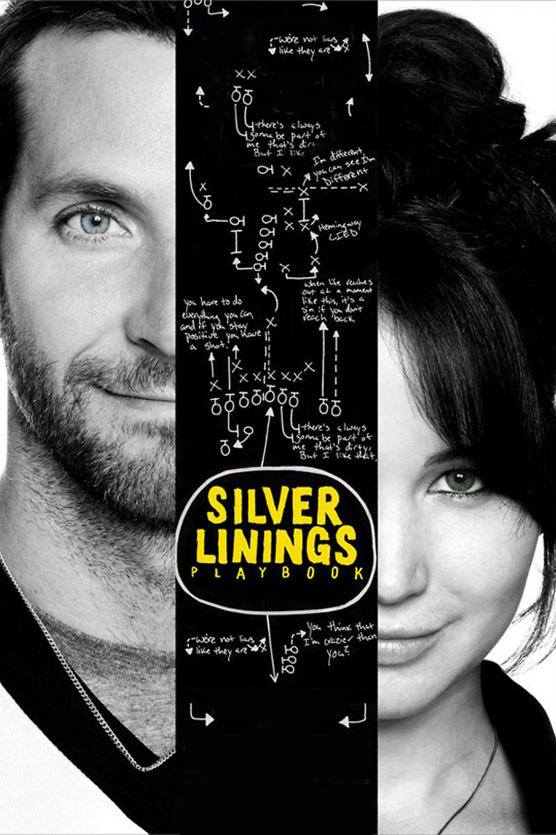
The poster they show is NOT the one I've seen. The poster I've seen has a handwriting typeface, and a diagram of a(n American) football play on it. I doubt that diagram would mean much in non-football-playing countries.
But the font they replaced it with (slab serif / ITC Lubalin) has "athletic" connotations in the US - it's a classic "varsity letter" font. Does that connotation carry over outside the US though?
You can set it as the homepage (enableable in Settings). It adds an extra step after opening a new page (either clicking on the home icon or shift-cmd-h) but I prefer that to replacing the default Chrome page (with its Most visited and Recently closed menus).
As a developer trying to gain more insight into proper design methodology this really spoke to me. With all the articles and discussion around "design" really focusing more on aesthetics, for some time I thought that was all design is about.
For example, I work mainly on mobile apps, and it took some time for me to view another app's design with an eye for more than just "looking pretty". You really have to think a bit differently to begin noticing the small things the designer did to make the experience more enjoyable.